Creating a B2B e-commerce website for a leading architectural ironmongers

Fred. Olsen Travel is an independent travel agency that offers worldwide holidays, cruises, city breaks and more operating under brands such as Fred. Holidays, Fred. Olsen Travel Agents and Fred. Olsen Business Travel.
The agency has multiple online platforms that are used to promote the holidays and experiences available.
| Sector: Travel | Services: UX Audit |
Scroll to discover
Fred. Olsen Travel requested assistance to evaluate and improve the UX/UI aspects of one of their websites.
The aim was to generate an increased number of email enquiries and phone calls from potential customers and agents. They believed that a seamless and user-friendly online experience is crucial to achieving this and therefore needed guidance on the next steps.
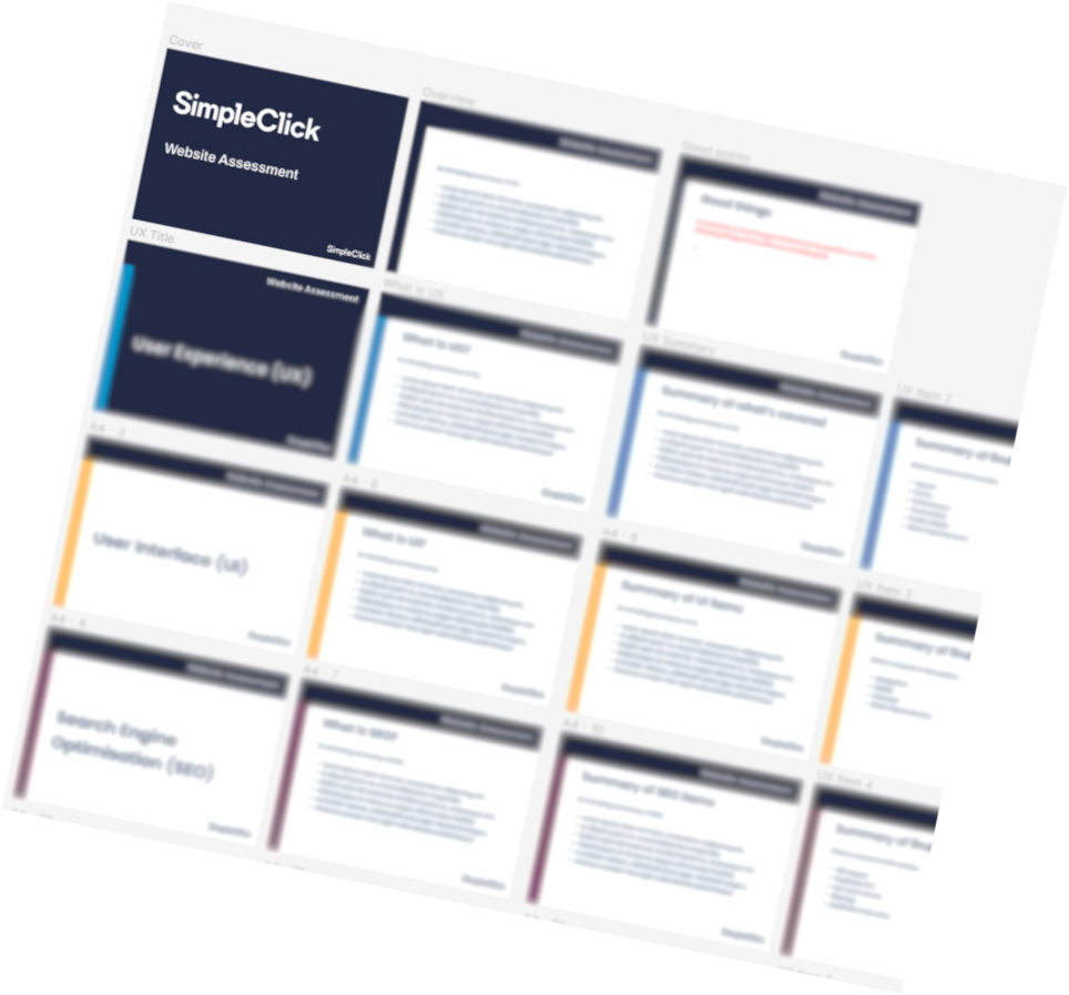
A full UX audit was carried out on the site by our team of UX experts, which looked at UX, UI, Accessibility as well as top level technical SEO.
The issues identified were grouped and analysed before recommendations and suggestions were made on how to improve the user experience.
The audit focussed on actionable tasks designed to be quick to implement to allow instant improvements to be made across the site.
Mockups of alternative layouts and ways of presenting content were included where appropriate to help visualise the recommendations.
The audit focussed on the following areas: