7 quick wins to accessible content

But First, What Is Accessibility?
I’m glad you asked! Accessibility can be split into 3 main categories of impairment; situational, temporary and permanent:
Permanent impairment issues are typically the easier ones to identify and that people naturally think of - deafness, blindness etc.
Temporary impairments could be something such as a short term injury or an ear infection making hearing difficult.
Situational impairments could be something as simple as a new parent trying to carry a baby and use their mobile phone or someone at a new desk with monitors further away than they are used to.
These can also be further broken down into 5 types of impairment:
Visual - issues such as blindness, colour blindness, cataracts, epilepsy etc.
Auditory - deafness, hard of hearing, tinnitus, ear infections etc..
Motor - paralysis, tremors, sports injury, inability to use limbs etc.
Cognitive - learning difficulties, autism, short attention span etc.
Speech - non verbal, laryngitis, a heavy accent etc.
OK, So Why Do We Care?
Well, when creating our website we want to make sure that it can reliably be used by as many people as possible to achieve our business goals, whether that’s informing people, generating new business or making sales etc. so generally the more users the better!
According to the UK government in the 2020-2021 financial year, 22% (or 1 in 5) of the UK’s population, that’s around 15 million people, have a disability of some kind, and globally that equates to over 1 billion people according to WHO . That’s a whole lot of people that we could potentially be losing business and engagement from due to poor content accessibility!
If a user can’t access the content they need, interact or make a purchase they are unlikely to revisit your website and potentially could be won over by a competitor. Why would you want to alienate a fifth or more of your potential audience?
In addition, an accessible website usually works better for everyone, often being faster, easier to use and as a bonus appearing higher in search engine rankings!
Did you know : In the UK website accessibility is covered under the Equality Act 2010.
Right, What Can We Do To Improve Our Content Then?
1 - Write an accessibility statement
This tells your users that, actually, you recognise the need for accessibility and that you as a business have committed to do something to address it.
2 - Create a sitemap
A sitemap is a great idea and a must have for every site, not only is it an extremely useful tool for accessibility, helping users quickly find their relevant content and navigate your site but it’s also used by search engines to process your site and will boost your SEO!
3 - Use Headings and subheadings properly
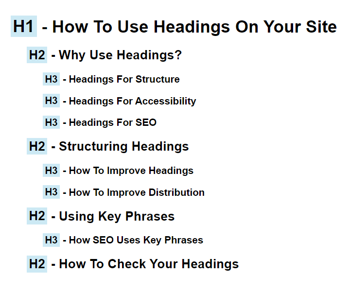
Users will use these as signposts to navigate themselves to their desired information and this is especially so in the case of screen readers. So it is extremely important that these are concise, relevant, and follow a hierarchical structure. As this is on your website and not in print, using headings for structure is the primary goal, done properly by nesting headings starting at h1 down to h6 and not just to visually prettify content - although sizings can benefit visual users too if used correctly.
Not only is this better for your users but will also benefit your site by making it easier for search engines to digest and may result in better rankings.
4 - Use Correct Alt Tags
It cannot be stressed enough the importance of your alt tags on images, screen readers will use these to describe the image to the user so it needs to contain the important information upfront and should not, under any circumstances be filled with spam tag-like words. And preferably be under 100 characters in length to avoid giving the user a short story.
Think, if you were describing this image, on a contact page, to someone who couldn’t see it, what would you tell them? Would you use “Contact us image” or “Doorway to a meeting room with a blue sign saying ‘Space to meet & greet’” - I think you can tell which is the more descriptive.
The exception to this is if the image has a link on it, then it should convey a description of where the link will be going to the user, as if it were a text button.

5 - Use Descriptive links not generic ones
We’ve all done, and we’re all guilty of it, “to find out more about us click here”. If a user is using a screen reader they can experience something called screen reader spam, where they hear the same text over and over again. Imagine a home page with multiple button links all saying “Click here”, “Click here”, “Click here” over and over again - it’s enough to drive you mad.
Instead it’s far better and more informative to rephrase the context to “to find out more, read About Us.” And try if possible to not use full hyperlinks as the link text, otherwise the user will have the whole url read out, in some cases letter-by-letter.
6 - Think About Your Multimedia
What do we mean by your multimedia? Well, things like videos, PDF downloadables, audio clips etc. For videos, try to avoid flashing imagery (or post a warning), if they have a speaker can you see their lips to read or check that they have subtitles available, what about an audio commentary version or even have a downloadable transcript; that last one also applies to any audio clips you may be using too. For PDFs or any downloadables, can these be accessed by a screen reader? Or is the text just flat imagery - would a word document suffice better?
7 - Check your colours
A lot of websites nowadays use colour as a way of indicating clickable or interactive links, whilst great for people with normal vision, it can be very problematic for people with visual impairments particularly when this is within a block of text. The easiest way to provide a non-colour indicator is to use an underline that is always visible, not just on hover or perhaps include an icon of some kind or potentially a pattern.
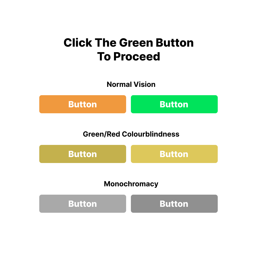
Colours should also be a consideration when putting text on a background colour, such as on a button. The WCAG recommended contrast ratio between its link and a background is 4.5:1 so that it can be seen by a variety of visual impairments including colorblindness. And whilst a colour may look completely different from another, to a colourblind user it may look completely different and without further instruction may be confusing - see the image below.
Parting thoughts
So now we’ve given you our top 7 content tips for improving your accessibility, whilst this is by no means an exhaustive list, you are now well on your way to making your website a great place for your users to visit. And remember - what benefits the few, also benefits the many when it comes to usability.